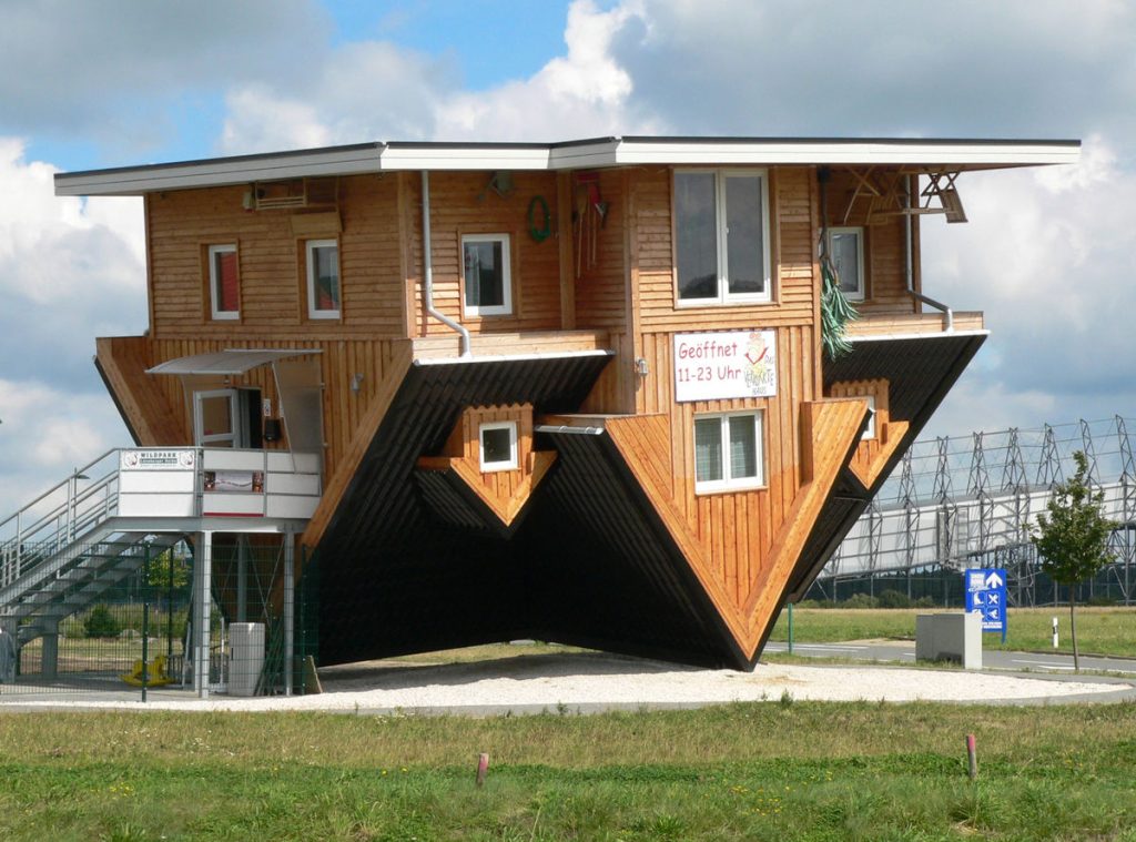
Experiencing and exploring well-designed and aesthetically pleasing buildings is one of life’s little pleasures. But there are times when architects take things a bit too far.
Far from enriching the lives of those who use it, some architectural decisions can feel a little out of context or downright inappropriate. Bearing that in mind, here are 7 examples of “interesting” architectural design choices from around the world.
What is the objective of architectural design?
Architectural design is the process of creating human environments, like buildings, that are both useful and inviting to its occupants. Designs vary widely, and architectural designs have changed throughout the ages as artistic tastes and the public zeitgeist have evolved through time.
While there can be hark-backs to styles of yesteryear, most modern architectural designs attempt to push the boundary of what is possible with current building material technology.
“The task of architecture is the creation of human environments. It is both an expression of human values and a context for human activity. Through the design process, architecture addresses the interrelated environmental, behavioral, and cultural issues that underlie the organization of built form”.
1. Is it an arch or a chimney?

We are not quite sure what to call this impressive piece of brickwork. Is it an arch? Or a non-opening chimney? Perhaps we should just call it an “Arch-Chimney?”
Whatever the case, this is certainly an excellent example of “out of context” architecture.
But, the reality is a little less impressive. This piece of public art can be found in Rhymney, Caerphilly, Wales, UK, and is roughly 8 meters high by 16 meters long.
Called the “Twisted Chimney”, it was created by Brian Tolle and is located near a former ironworks. It is, in fact, crafted from polystyrene and painted to resemble brickwork.
2. This is a bench?

Here is another interesting example of architectural design that doesn’t seem to really fit. Looking like a piece of the floor has been ripped up, this is actually intended to be a bench, of sorts.
For anyone with chronic OCD, its design may bother you intensely. You might be overcome with the instinct to attempt to put it back?
This piece can be found outside the Laing Art Gallery in Newcastle-upon-Tyne in the United Kingdom. It forms part of an art installation called “Blue Carpet” and was designed by Thomas Heatherwick.
First installed in the mid-1990s, it is both loved and despised in equal measures by local residents.
3. Is this building dilapidated or meant to look like that?

Whenever you see an overgrown building, you would be forgiven for thinking it’s being left to rot. But this building in Singapore appears to have been purposefully designed this way.
Called the Parkroyal, it is actually the facade of a luxury hotel in the heart of the city. The hotel’s “hotel-in-a-garden” design was widely lauded for its unique architectural design when it first opened its doors in 2013.
Each of the hotel’s “sky gardens” is designed to be completely self-sustaining. Each makes use of solar cells, rainwater harvesting and reclaimed water systems to make them environmentally-friendly as possible.
Despite its obvious impressive design, it kinds of feels “out of place” in the heart of an ultra-modern city. But, everyone’s a critic.
4. Quite possibly the most useless stairs in the world

Here is another interesting architectural design choice. These “stairs” appear to be more of an art statement than a functional architectural element.
Imagine trying to negotiate this staircase in the dark, or inebriated! Fun, fun, fun.
Or, perhaps, the client was something of a fitness-freak. This staircase would be an excellent “free” exercise machine for toning your glutes and calves.
5. Would you eat in this restaurant?

Found in the H.R. Giger Museum in Gruyeres, Switzerland, this literally-ribbed ceiling is an impressive piece of architecture. The architectural design is, of course, perfect given Giger’s very unique and amazing artistic-style.
It is also, in its own way, quite beautiful.
But, since this is meant to be a place to eat, drink and relax, it could also be argued that this might make you feel somewhat squeamish, if not wary. Who wants to be reminded of death and decay when they are eating?
Plus you’d be forgiven for wanting to grab yourself a flamethrower and pulse rifle just in case. We definitely wouldn’t want to visit it at night.
6. Seriously? What were the architects thinking?

The Christian Science Church in Dixon, Illinois doesn’t look too out of place from street level. But when seen from above everything changes.
In the architect’s defense, their hands appear to have been forced when designing the building.
“Prior to 2011, the Dixon Christian Science Church had a different shape. But when the Environmental Protection Agency discovered contaminated soil beneath the church’s domain, the building had to be torn down and replaced. The church staff drafted a blueprint for the replacement, calling for a long, rectangular shape to allow for natural lighting, with a curve in order to preserve an oak tree to the south of the church.
As inappropriate as the design is, it has literally and figurately put the church on the map.
7. This gargoyle is a little inappropriate

This gargoyle can be found at the Freiburg Cathedral in Germany. This might be one of the most dramatic, and earliest, examples of protest art we have ever seen.
It would be interesting to know the reason for this completely inappropriate piece of architectural design. But, on the flip side, it is incredibly funny.


Comments are closed